ShopDreamUp AI ArtDreamUp
Deviation Actions


Description
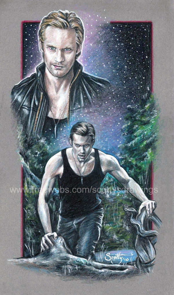
Here is my latest drawing. This drawing features portraits of Alexander Skarsgård as The Vampire Eric Northman as seen in the HBO series "True Blood".
Size 11" x 18 1/2"
Drawn with No. 2 Graphite pencil, Prismacolor colored pencils with white acrylic highlights.
Drawn on Strathmore Colored paper
True Blood, Eric Northman and all related characters and properties (including the reference photos) are copyrighted by HBO
Eric Northman was created by Charlaine Harris
Image size
900x1520px 871.35 KB
© 2010 - 2024 scotty309
Comments93
Join the community to add your comment. Already a deviant? Log In
...ORIGINAL CRITIQUE... PLEASE READ *there is some quick VITAL critique here*...
I wanted to critique this.. but I can't do it right now. I am not a great artist but I see one big flaw unless that's how his ear is... On the left hand side of this picture.. his ear looks weird. The only other thing I would like is if the border was more complete. (although I also like the way it is now)
Uhm you don't have to publish this as a critique because I didn't give you enough of way you got the score that you did. I will try to redo this when I have time and when I can be more thorough. But it's wonderful.
... NEW CRITIQUE... ( I will save the positives for later, you might get a positive here and there though)
Vision(4):
I gave this a four because as an artist. You would have it all in your head, and you have the ability to put it on paper. In order to have it colored you would have to have it sketched and then cleaned up. I wish it didn't have your watermark in the way of the picture so I could see the background. underneath the guy's armpit. Because I wanted to see how far it continued with the trees and whether the path stopped and whether or not it looked finished.
Originality(3.5):
The character doesn't belong to you. You stated it and that is why this originality is not a 0 but it is also why isn't a 5 or a 4. But that is okay, because what is hopefully original is the scene. I do not watch Trueblood ( yet), so I cannot clearly define whether it is referenced to a particular scene (except for the one in the background I read the comments) . So I like to say that what you have here is original in the way that you drew it.. ( I can't really give you a critique for originality, that is very difficult to do with any piece of art.)
Technique(4):
I like your traditional technique (I am keeping all the info I know about you since I watch you separate and trying to give you a fair and honest critique then one of a fan which would just say I love your work, you are so good.. amazing!). The hair looks real on the smaller one.. not the bigger one. It does have the feeling he was swimming in the water. Your use of color pencils(that is what you are using, right?) has some fault though. The black tank top he is wearing, doesn't look as good colored in that angled way then the jeans. The jeans look more realistic but the shirt not so much.( again on the smaller picture) On the bigger one, the leather jacket looks realistic and so does that black tank IN THAT big picture. I don't know why I feel like on the big picture the head seems smaller than it should be (It feels awkward to me, unless that is how the actor looks thick necked with tiny head). I would like to comment on the background but the watermark..
Impact (4):
It does have a strong impact for those who know and like the show. To me it still has an impact. The impact of how much it looks like the actor, how the scene and the etherealness/cosmic nature of the big picture. It almost looks like a movie poster and I would probably want to go see it. In it's minimized state it would almost look realistic. It would take a few seconds to see that it was really drawn. Unless it was the really tiny thumbnail size then it would look like a picture that the network would have done. But I know it could have been better, if you read the quick critique a lot of what I wrote there is fundamental to this subject.
Positives:
Realistic
your signature is in a great place
The shading is in my opinion perfect and shows where the light is coming from.
The trees that I can see look good.
The branch or log he is on looks sturdy and well detailed.
The necklace is visible and well defined in both pictures.
The big picture blends well with the back ground and then becomes solid.
The white outline is very even.
The definition to the body is nice.( this should be implied with the shading)
Your hands on him are rightly positioned.
The ear on the right hand side of the picture is perfect!
Now I am not an artist of your caliber, so you do not have to accept my critique. But I know one thing that I can do that a lot of people sometimes can't see. I see flaws. I love the picture, but I do see flaws. Flaws are alright, but I just wanted you to see which ones pop up at me. What you can improve on.